Projects
Fella, Mobile App Project
Social networking app with CRM features

year
2022
timeframe
6 months
tool
Figma
category
Redesign
Fella is a social networking mobile app with CRM features. It is geared towards nonprofit church groups to help its members to stay informed and connected.
In the beginning, it started with two developers. New features were added over time to transform an originally attendance taking app to a social networking app to connect people.
In 2021, I was brought on as Fella’s first designer and made usability improvements. In 2022, we decided that we would do a complete redesign of the app that includes changes to UX, UI, and logo.
Objective
Early on in 2022, the team was in touch of 3 additional community groups that showed interest in using the Fella app.
Along with the interested parties, Fella’s active users ranged from high school-aged students to parents in their 40s. We knew that there are desirability on Fella’s features, but its usability had a lot of room for improvement.
In order to clear previous tech and design debt and avoid future ones, we decided to do a complete redesign of the app - specifically focusing on the user experience and the Fella brand.
Since there were no designer input prior to me joining, a lot of screens and interactions had to be evaluated and possibly redesigned. We also have a 6-month timeline with everyone on the team having their own full time job, priorities had to be precise.
Understand
In order to be precise in design priorities, I had to understand our users. With time constraints, I could not create a complete user persona.
However, there were 2 types of user profiles, which also determine which features they have access to:
Admin user
Non-admin user
Goal
With the users in mind, the most user-facing features, and general feedback of time spent on user task, we prioritized the efforts on the following screens/features:
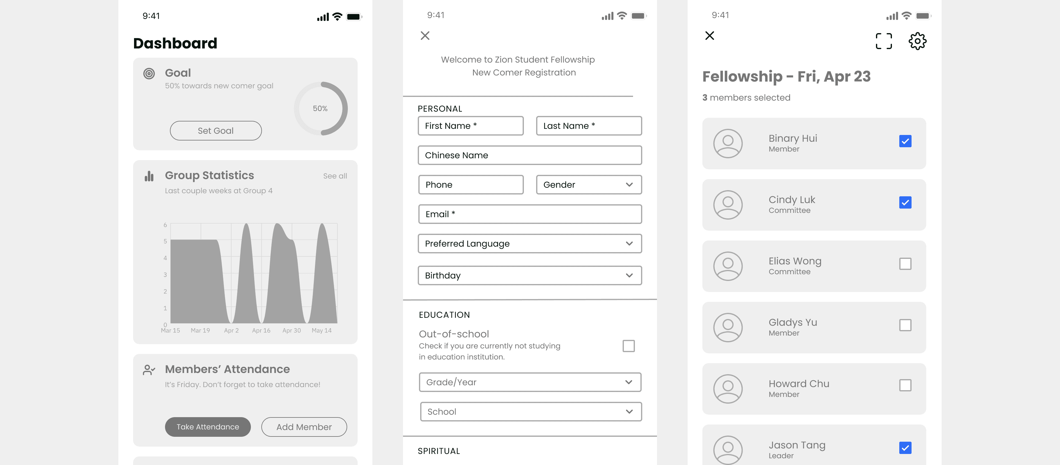
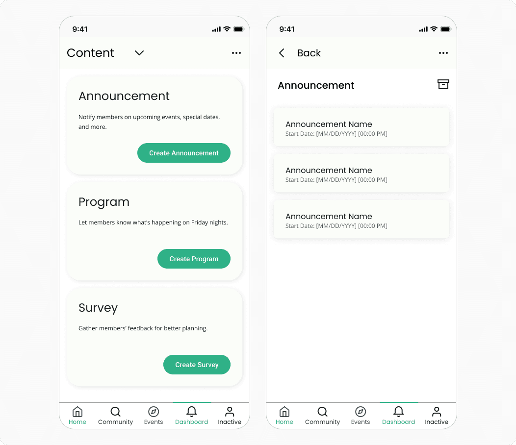
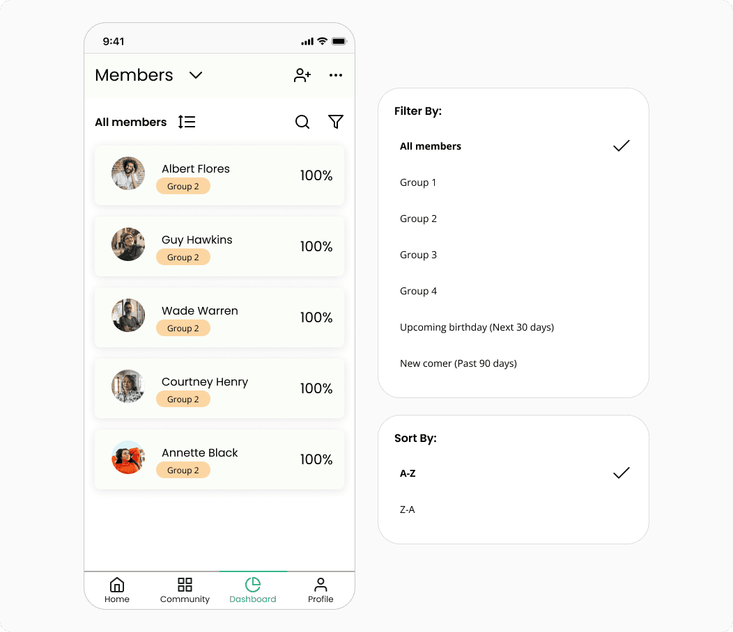
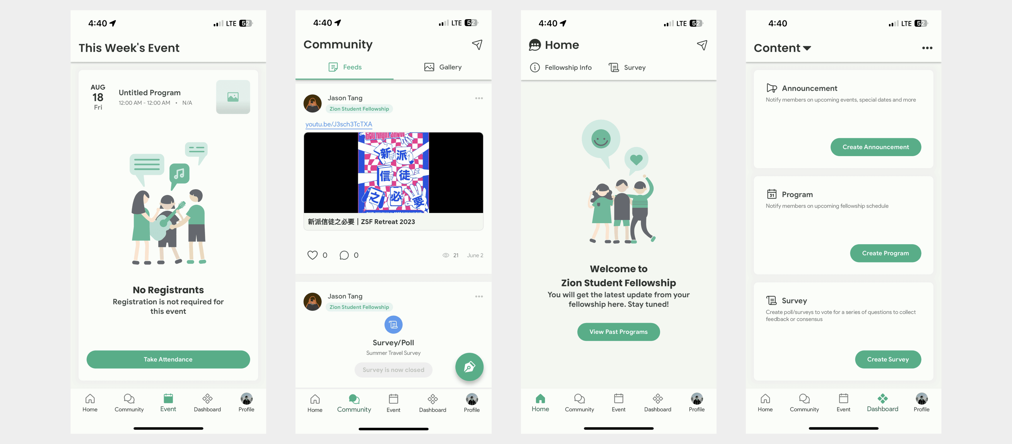
Dashboard
Event
Home
Due to the timeline, we also decided that creating a MVP is most ideal.
My Process
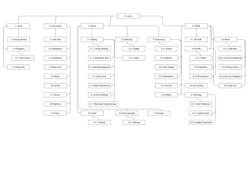
I’ve used a combination of competitive analysis, refinement of user tasks, creating site map and UX heuristics/principles, such as Hick’s Law and Jakob’s Law, to come up with solutions for UX improvements.
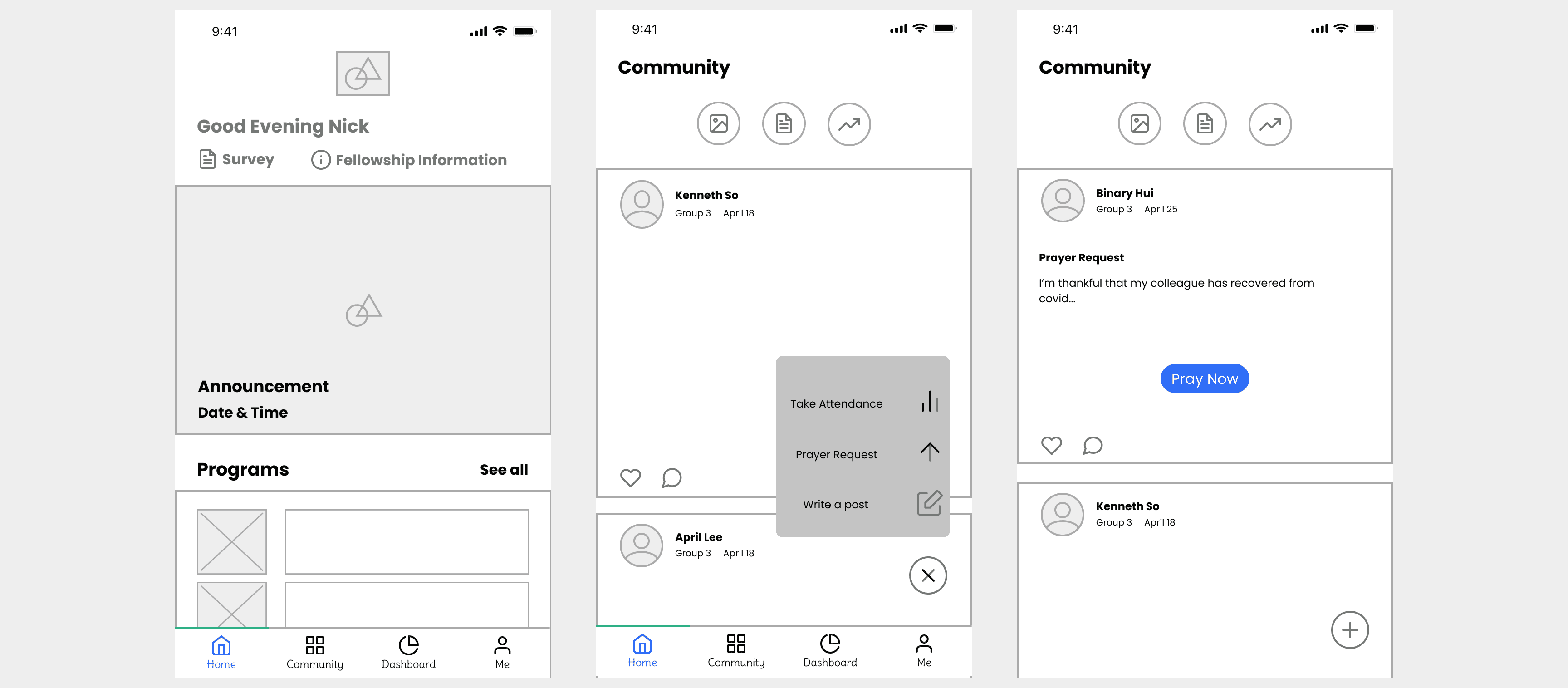
Wireframes
High Fidelity
For scalability and efficiency, I decided to go for modular designs where cards are leveraged. Modular designs could provide more flexibility and efficiency with future plans of expanding the native mobile app into a web app.
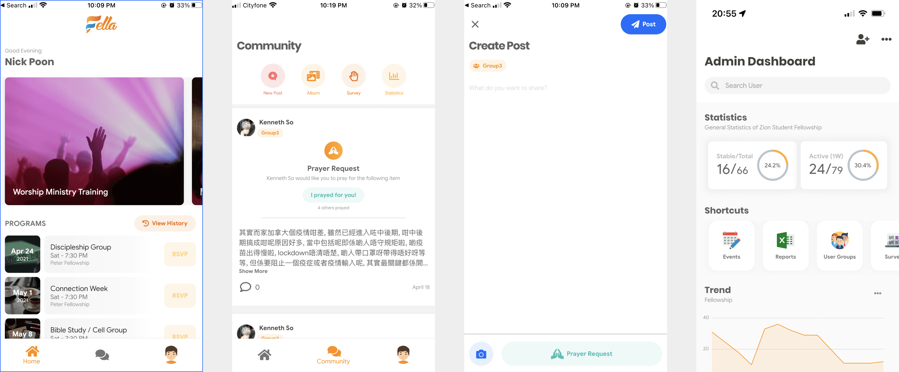
Final Designs
Fella is available on both the App Store and Google Play.

Impact
By September 2022, the team and I made the following impact:
Created redesign of Fella, including new UI, user flows and overall UX for Home, Community, Event, and Dashboard
Enhanced UX for admin features and program registration functionality
Implemented new logo, icons, illustrations, brand colour, font
Mentored a graphics designer that had no prior experience working in tech
Attracted 3 more community groups, which saw a jump from roughly 140 active users to over 600 active users


